Ticketing CRM
Redesigning how a company manages customer data and relations

Overview
The company uses too many applications to do their daily task, and when there is a problem with those applications, having to rely on a third party to fix them slows things down. Our solution? To create an application that condenses all customer relation management and interdepartmental assignment communication tools so that only one application needs to be used. This also lets the company be able to fix its own issues quickly and efficiently.
Project Type: End-to-End | New Product
My Role: Lead UX/UI Designer | UX Researcher
Project Team: 2 Developers | 1 Project Lead | 1 Designer
Project Duration: 8 months
User Research
Through interviews, usability testing, and analysis, I uncovered user needs, motivations, and challenges. Research findings directly influenced the product’s structure, functionality, and visual direction. As this product would be used by multiple departments for their own specific goals, I made sure to get insight from each department and organized the information accordingly.
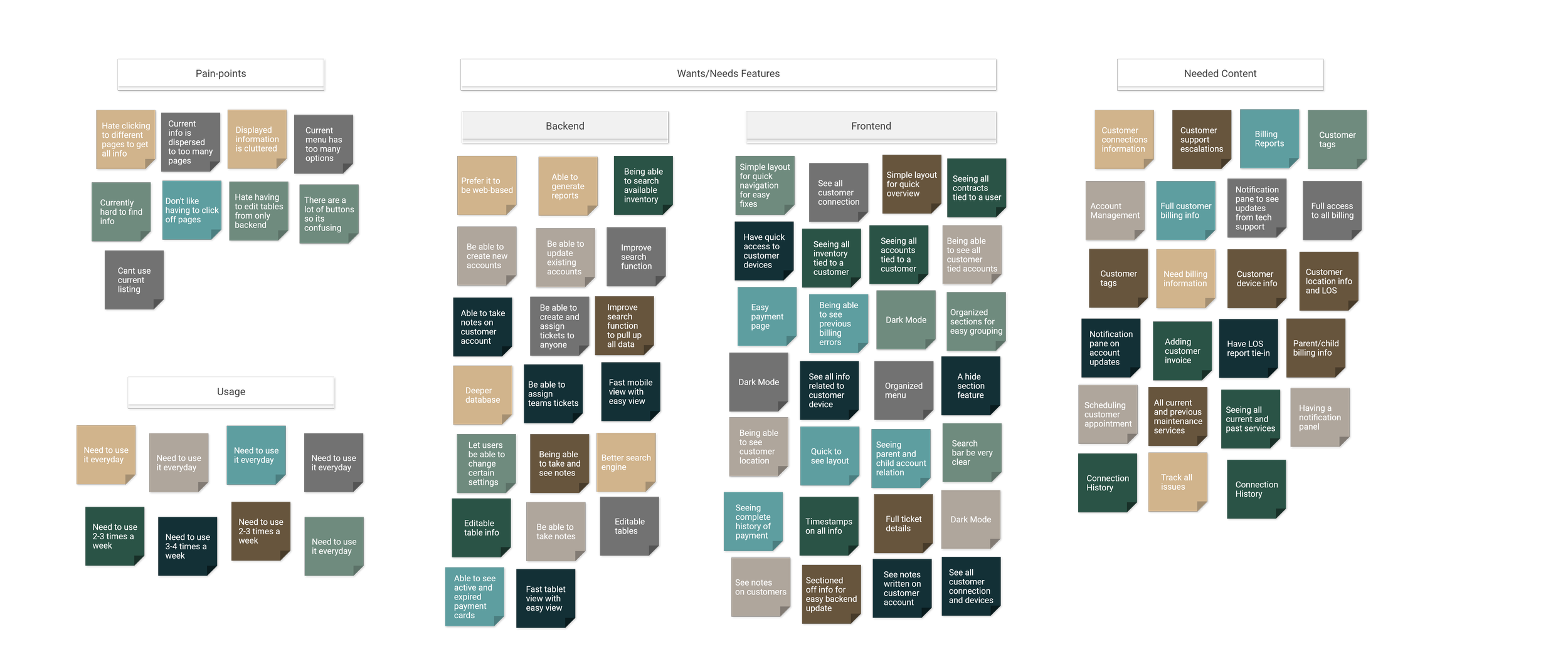
Affinity Diagram
Pain points, goals, and challenges gathered from interviewing each department using their current applications and products.

Storyboard
To explore user behavior in context, I developed storyboards for both Tech Support and Field Technicians. These visual narratives revealed differences in environment, constraints, and priorities, helping shape solutions that addressed the unique needs of each user group.


The same data rearranged and grouped into overarching categories to determine what features to prioritize.
Explore
Because this application needed to support a high volume of information on a single screen, layout decisions were critical. The exploration phase focused on identifying structures that could organize complex content clearly while maintaining visual hierarchy and usability. I tested multiple layout directions to evaluate how information density, grouping, and navigation patterns would impact clarity and user efficiency.
Potential Solutions and Layouts
I began with some paper sketches to quickly externalize ideas and test structural variations. Working on paper allowed me to focus on hierarchy, flow, and information grouping without getting distracted by visual polish. These low-fidelity drafts helped me explore multiple layout directions efficiently and identify promising patterns early, but to also eliminate problematic ones.

After identifying promising concepts from my sketches, I translated them into digital wireframes to refine spacing, alignment, and hierarchy. I developed eight distinct layout variations, each experimenting with different navigation structures, content emphasis, and visual rhythm. This allowed me to evaluate usability, clarity, and overall balance before narrowing down the direction.

Defining Scope
After synthesizing research insights, I defined the scope of the project to ensure focus and feasibility. Given the complexity of the information architecture, it was important to prioritize core user needs and identify which features were essential for the initial experience. This step helped align the solution with both user goals and practical constraints.
Full Layout and Timeline
To bring clarity to the system as a whole, I developed a comprehensive functional architecture map outlining every page, feature, and key interaction within the application. Given the product’s complexity and information-heavy nature, visualizing the full structure was essential to ensure cohesion, surface dependencies, and validate scope across teams.

With this system-level view established, we collaborated with stakeholders and cross-functional departments to define a realistic and achievable project timeline. By considering feature relationships, technical constraints, and resource availability, we developed a roadmap that balanced ambition with feasibility and aligned teams around clear milestones for execution.

Iterations
Design is an iterative process. Through testing, feedback, and reflection, the initial concepts evolved into more refined solutions. Each iteration addressed specific usability issues and aligned the product more closely with user needs and business goals.
Initial Assumptions
The initial idea was to have multiple sections or pages to display different groups of information. With each section grouping related information, we could keep screen real-estate moderately open and easy to navigate. Information would be grouped together according to the action that would be taken by users. After some usability testing feedback, I concluded that this initial idea was not optimal.
What I Tested
I split my testing into 3 phases:
Shadowing 1-2 people from each department and seeing their exact daily workflow. This was mainly to gather user task-flow, to see what software they used for each task and why.
Asking the people I shadowed to go through a simulated task (mirroring their previous tasks) on my 1st draft prototype and gathering feedback from them. This was to mainly see if the information I grouped into different pages were optimal or not for them.
I updated the design into a 2nd draft (keeping the same grouping of information) and asked them to go through another simulated task. This was to see if the change in design and slight layout would affect user task-flow.
Notes and Documentation

Initial Mocks

Prototype 1.1.0

Prototype 1.2.0

Prototype 2.1.0
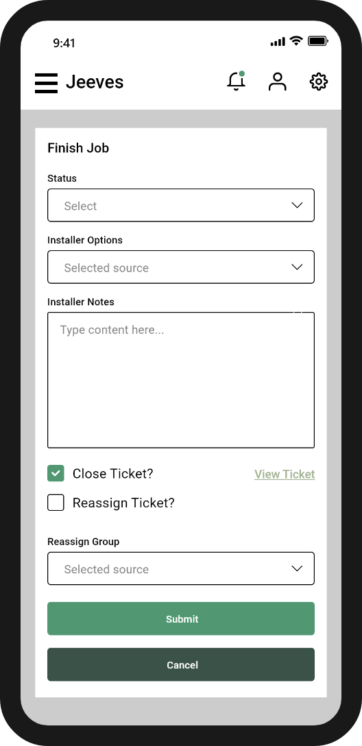
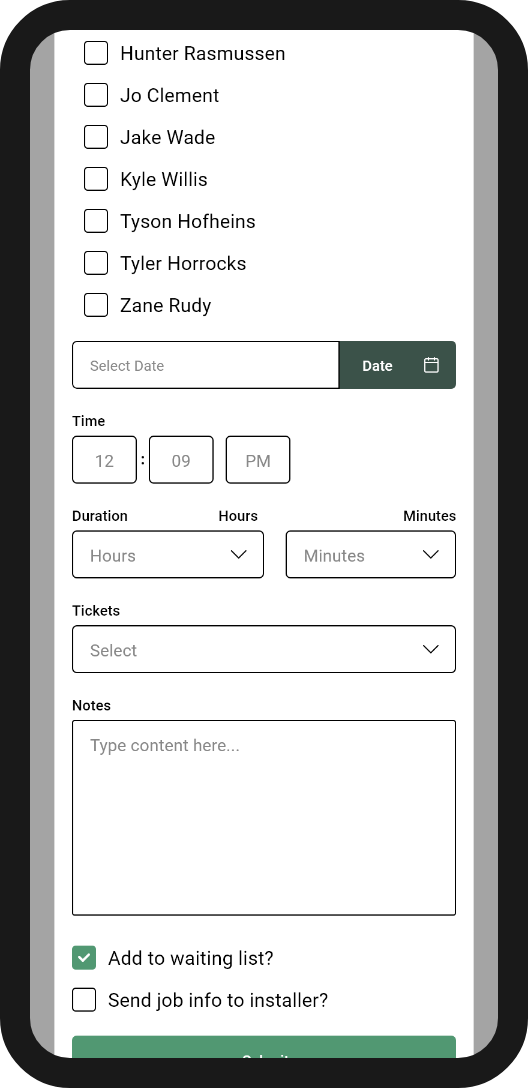
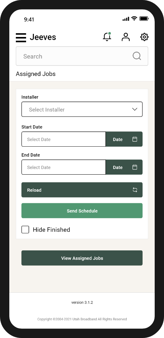
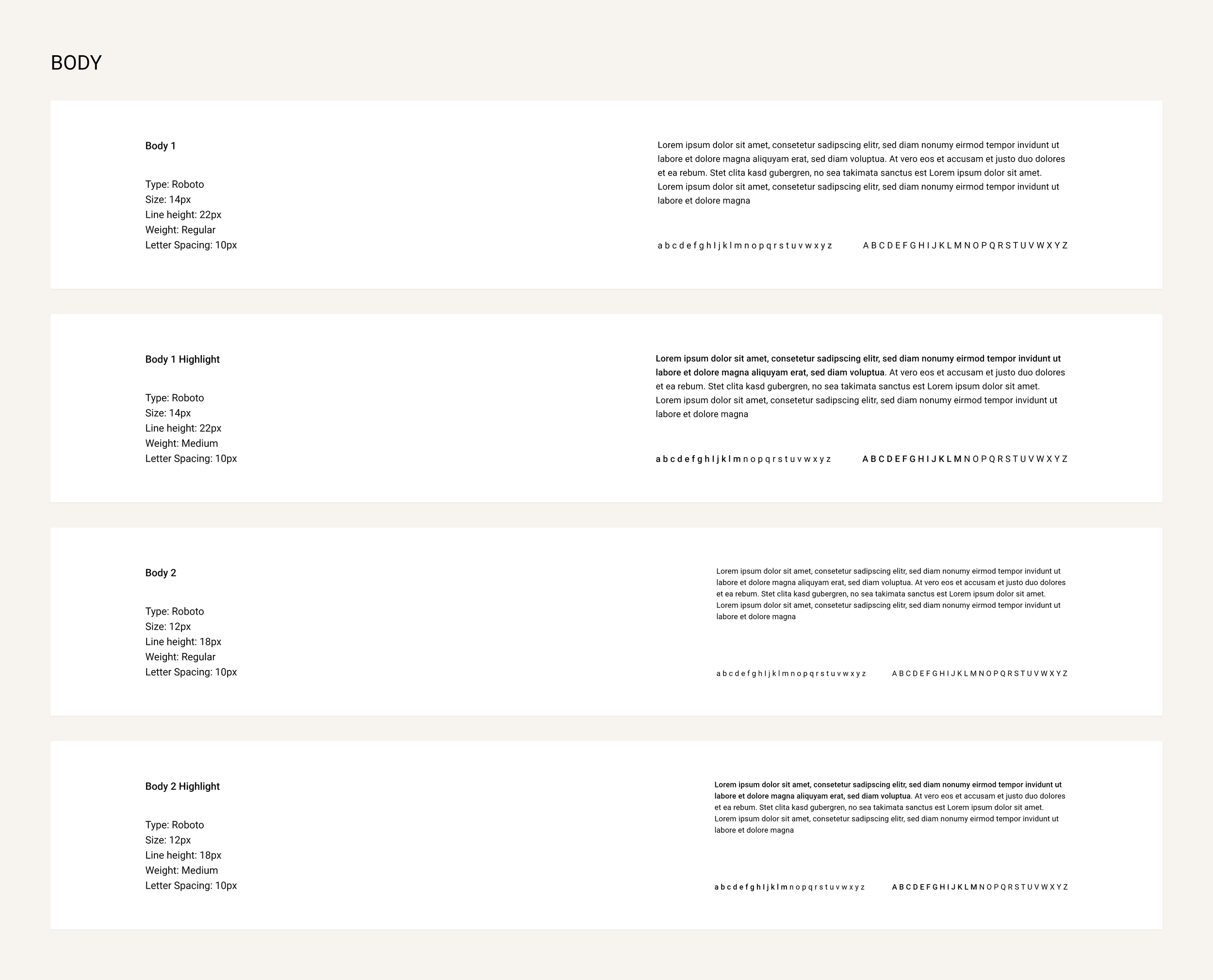
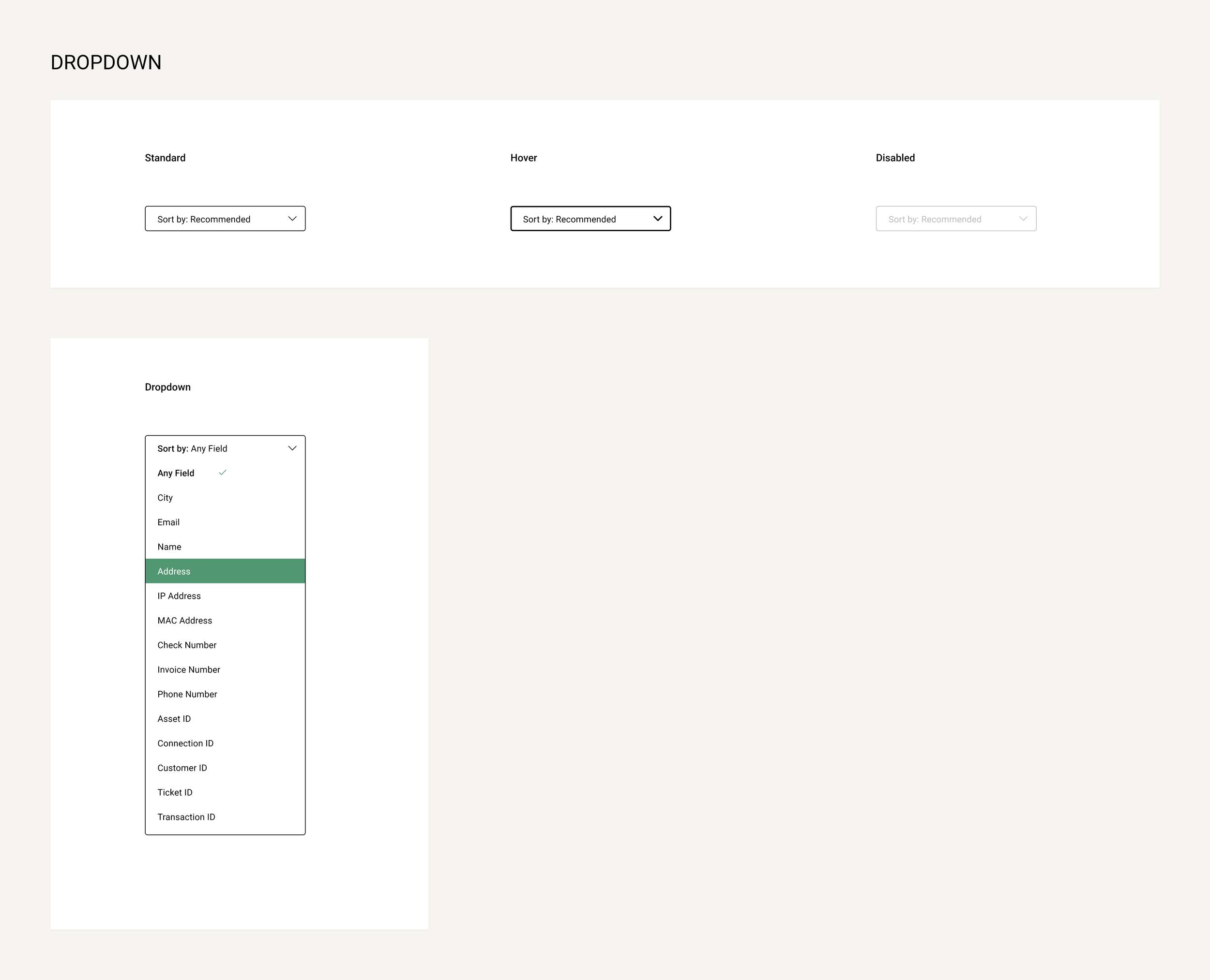
Final Handoff
After revising with the engineering team and finalizing the designs, I handed off the final product to be fully developed. In terms of designs, I gave the engineering and development teams the designs for both desktop and mobile versions, as well as a full style guide for them to refer to while building out the product to launch. I worked closely with the team after handoff to ensure that the initial launch went as smoothly as possible. The following designs are a few screens from the desktop version, mobile version, and style guide.